Rebranding of liquidFOLDERS – #ichmachwasmitmedien
March 6th 2015, 02:42 | Written by Konstantin KollWhat do brands like Apple, Boom Bap, Hollister and Liebeskind have in common? Learn more in this rare non-aviation article on marketing, branding and our company's corporate design.
Our company was launched in April 2009 and incorporated in March 2010. The first product was the relational file system liquidFOLDERS, and later our aviation software Flightmap.
Initial corporate design
When you're launching a startup company, especially a software company, there are a million things to do and think about—the brand is just one. It usually ranks pretty low, and definitely comes behind coding, testing and designing the actual product. If you cannot afford a professional, the brand usually leaves a lot to desire. We've certainly made almost every mistake in the book!
I've visited our virtual attic today, and dug up some pictures of our old logo and our first website for your entertainment:

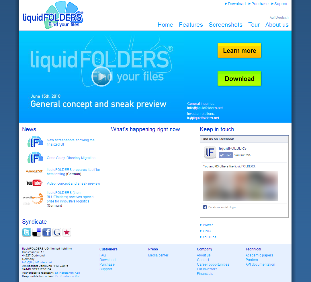
Not only did the logo look like a toy (even more so for a product that's out there to reliably manage your files), the website looked cheap. To make things worse, the logo was used inconsistently with a square version for icons and profile images on various websites, and even special background versions for our YouTube and Twitter accounts.
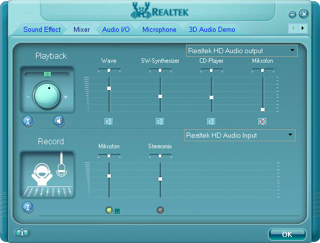
The only mistake we've skipped was imposing our initial corporate design on our software product. I was already appalled by bad custom UIs, the Realtek HD Audio device driver being a pretty common and exceptionally tasteless sepecimen. Instead, we've mimicked the various Windows UI themes as good as humanly possible.
As our product started to evolve and our company matured, I got increasingly unsatisfied with our corporate design. It was time for a proper rebranding across all media, including the product itself.
Fashion brands
Around fall 2013 I've noticed something very interesting among fashion brands, which would come in handy for the repositioning of liquidFOLDERS: many fashion brands use a city or region name as tag line to connect with the perceived image of the location. These are the ones I can think on top of my head, omitting the obvious suspects like “American Apparel”:
| Brand | City or region | Remarks |
| Abercrombie & Fitch | New York | |
| Apple | California | Apple rarely uses California in advertising, but all newer devices have “Designed by Apple in California” engraved on the back |
| Boom Bap | France | “French kick ass brand” |
| Gilly Hicks | Sydney | Concept brand of Abercrombie & Fitch, with a fake story of a girl moving to Sydney |
| Hollister | California | Concept brand of Abercrombie & Fitch |
| Liebeskind | Berlin | |
| Pepe Jeans | London | |
| Scotch & Soda | Amsterdam | “Amsterdam Couture” |
| Superdry | Japan | Superdry often uses JPN and machine-translated Japanese glyphs (similar to Engrish) |
The following corporate video of “Liebeskind Berlin” makes it quite obvious. The successful German fashion label, mostly offering women's bags and accessories, is tying itself to the perceived image of Berlin, Germany's “poor but sexy” capital, where somewhat “hip” people use the city as their playground and experience emotional “Berlin moments”:
Please note that this corporate video is completely emotional, as a Liebeskind product is never recognizable throughout the entire film (ok, you got me: the girl's bag in the third cutscene probably is a company product).
I wanted to replace the tacky “Find your files” claim in our old logo with a city name, similar to successful fashion brands. Both the cities of Dortmund (our former home) and now Iserlohn aren't suitable at all, however, as they are unknown outside of Germany. “liquidFOLDERS Iserlohn” would instantly turn the brand of a globally selling software company into a joke (no offense, we really like it here).
The other day, I've stumpled upon an item that had “Made in Germany” embossed. That was the solution: Germany is well-known for high-quality products and excellent engineering—values we hold high and embody into our software. So the new brand was “liquidFOLDERS Germany”—with the neat side effect of available .com and .net domain names. Since then, the “About” dialog of all our software products features the claim “Engineered by liquidFOLDERS in Germany”.
Though hardly noticable at first glance, A/B testing revealed a significantly higher conversion rate when a logo with the ”Germany” tagline was used.Visual design
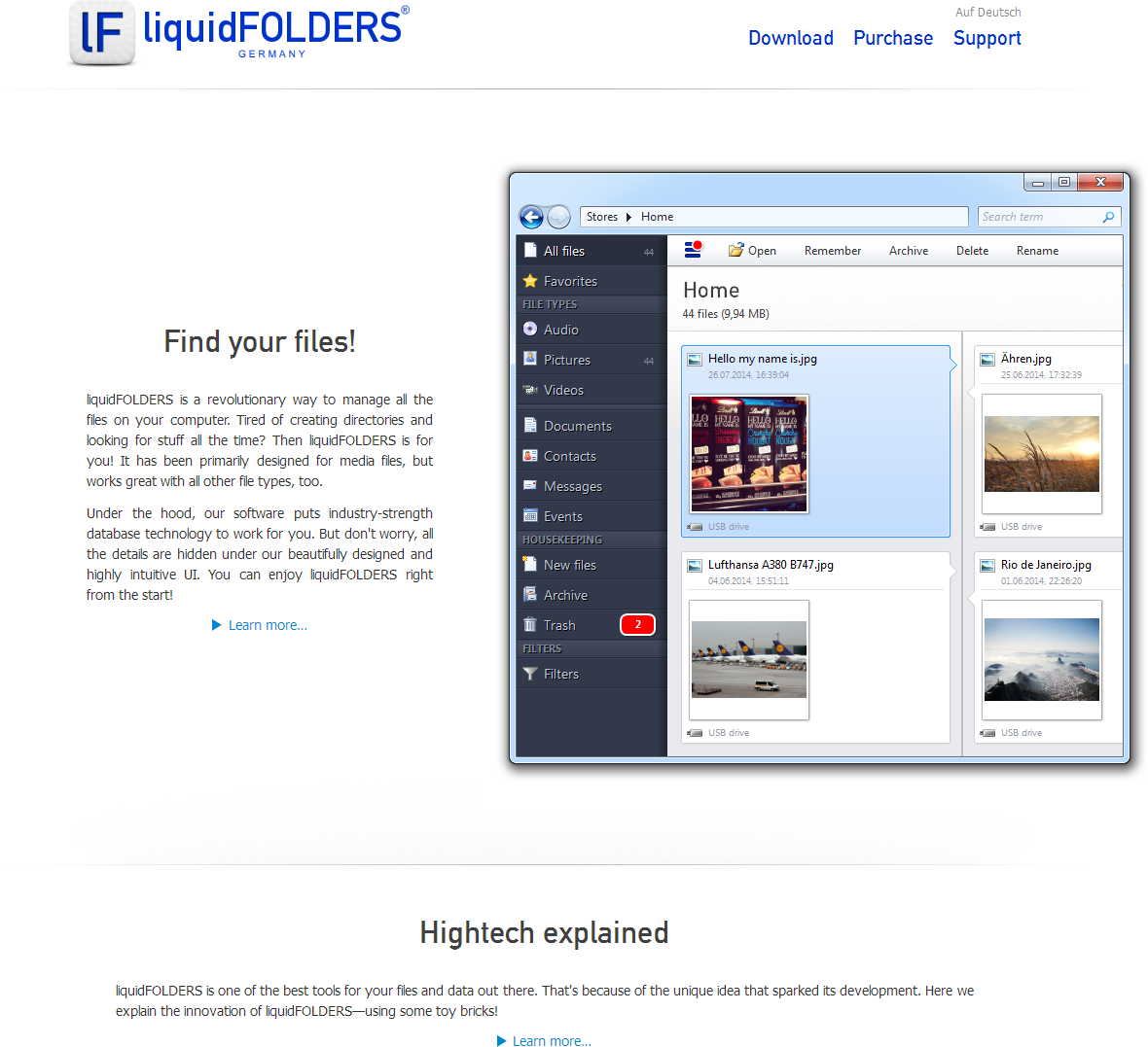
Coming up with a great visual design was a completely different challenge, though. Two features of the initial design were left unchanged: our company font (“DIN 1451 Mittelschrift”, which conveys sincerity, technicality, and is often used in engineering), and the deep blue color.
After countless iterations, I came up with some very sophisticated visuals. What hit me was the movie “Oblivion” (which is a really great flick, by the way):
I was stuck by the white, futuristic, almost sterile look of things. White is a really great color for visual designs: it is Window's default background color, so it would be non-disruptive in our UI. White goes well with the deep shade of blue in our logo, and incidentally it's also the default color of almost any paper (with printed media in mind).
After a few tries, I came up with some very light gray visuals to highlight areas on paper, in our software, and on our website. Together, these elements make up our current corporate design and liquidFOLDERS brand (click here to read more about my design choices):

Thanks for reading—the next posting in the Flightmap blog will be definitely on aviation again :)