What's wrong with the iOS 7 icons?
October 13th 2015, 14:43 | Written by Konstantin KollMy previous article on flat design has stirred up quite some controversy. Here's the promised second part, giving the iOS 7 icons some attention.
Update
First, an update: more and more people seem to jump on the bandwagon to bring back realistic design. Watch this great interview with Neven Mrgan:
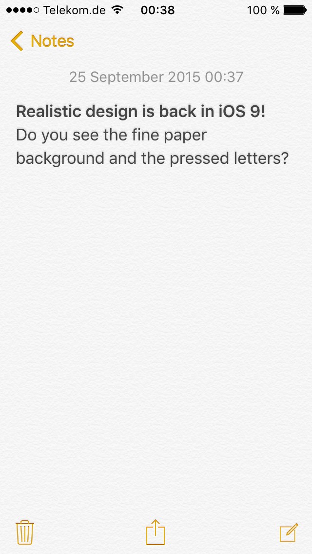
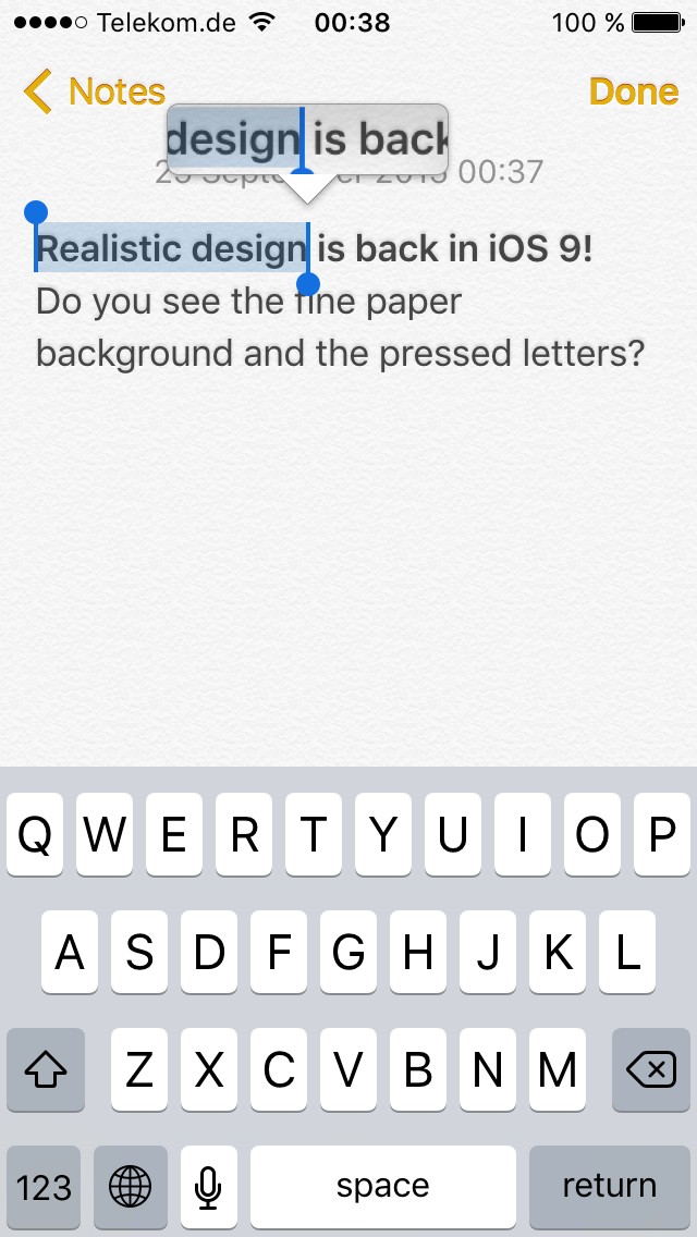
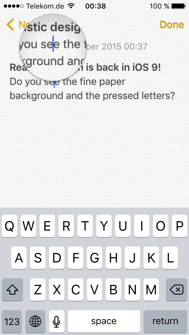
Several readers have pointed out that some form of realistic design is back in iOS 9, namely in the “Notes” app. Do you recognize the fine paper texture in the background, and the letter press effect? The magnification glass has some reflections and shadows—that's just the opposite of the flat design mantra of “profound and enduring beauty in simplicity, in clarity, in efficiency” as stated by Jony Ive:
It's hard to guess what's really going on at Apple, but maybe—just maybe—sanity has been restored, and the UI team at Apple regrets their switch to flat design. If so, Apple will never admit their mistake, but wait for several more years until the next design overhaul is due for iOS. We'll see!
Icon design
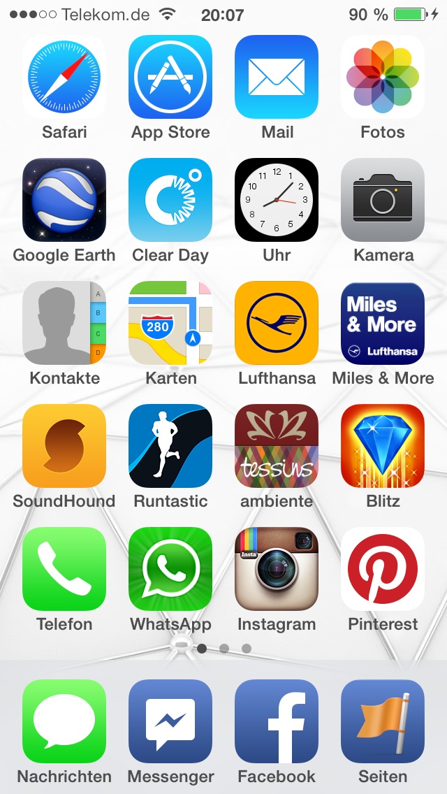
Back to the issue at hand: the new icon design that has been bothering me since iOS 7. Here's a comparison of the iOS 6 and iOS 7 springboard (“home screen”):
Apple's icon design, for which it was an industry leader in the past, has significantly degraded with iOS 7 and the change of management (read: booting Scott Forstall). Basically, the iOS home screen has turned into a gaudy and inconsistent mess.
The first issue is the icon mask: app icons in iOS 6 use roughly a third (35% to be precise) of a side's length for the rounded corners on both sides. This has been increased to 40% with iOS 7, making the icons appear unnaturally playful and much less sincere (yes, 5% make a noticeable difference here). In addition, app icons do not have any chrome like borders, reflections or shadows. This has the bad side effect that no matter what wallpaper you choose, there's always that one icon that blends with the background color—something that doesn't happen with a border or shadow (btw., in the screenshot above it's the Safari, Photos and Pinterest icons that blend with the white wallpaper).
I will not even bother to go into the screaming colors “straight out of the tube” here.
As for the inconsistencies: some icons do have gradients, others don't. Some gradients are opposite, like the Safari (light to dark) and Mail (dark to light) icons. When designing a user interface, consistency is the topmost priority—no wonder that most people find the iOS 6 design much more user-friendly than iOS 7, despite the fact that flat design is supposed to make things easier.
The point is that the iOS icons feel cheap in their simplicity. Customers do not get the impression of a carefully crafted, visually rich user interface anymore where a lot of effort has been put into. Heck, you could even re-create the iOS icons with Microsoft Word in no time:
Lessons learnt
It's quite easy, though pleasureable, to write a rant on an issue. It's much more difficult, but also much more mature, to do stuff better. As you may know, we put great effort into design and branding of our software—and this includes icons! For the new version of liquidFOLDERS, our relational file system, we've improved all badges for our store icons: the different colors give a hint on the store's state, including a verbal description (when fitting in the particular language), and the badge lies realistically on the threedimensional icon, including drop shadows, correct lighting and a subtle texture.

We're planning some great things for a Flightmap redesign, of course with full-blown realism in the UI—so stay tuned!